Thought You Should See This, June 22nd, 2012

Here’s what happened this week on the innovation/design-themed blog I write:

Designer Armin Vit went on a rant against the use of Helvetica. “The main argument of using Helvetica is that it’s “neutral,” he sneered. “That is absolute bullshit. There is nothing neutral about Helvetica.” Well, he’s got a point.

Marina Abramovic: The Artist Is Present has opened at cinemas. The documentary is arguably more hagiography than critical analysis, but I loved to see the playful and charming side of the legendary performance artist.

Fascinating and thought-provoking video looks at all that goes into creating food advertising imagery, in this case photographing a McDonald’s cheeseburger.

Now that Microsoft is building and selling its own tablet, the Surface (top), most people think it’s copying Apple,” writes Jay Yarow over at Business Insider. He then goes on to explain why this is absolutely not what’s happening.

Martha Stewart CraftStudio represents no less than a profound change in thinking at the company. As Chief Integration and Creative Director, Gael Towey noted to me, the app helps to put power in the hands of the consumers. A great example of a company noting a shift in the economy and customer needs–and looking to do something about it.

Finally, watch out for an upcoming book from John Edson, president of Lunar. Design Like Apple contains seven principles for implementing sensible, thoughtful design. The book’s available for pre-order now.

Advertisement

Thought You Should See This, June 15th, 2012

This week’s Thought You Should See This update for my colleagues at Doblin and anyone interested in innovation and design.

Top marks this week to Larry Keeley, whose pearls of wisdom form the foreword to a new book on mobile interaction design. As Larry writes, “With mobile devices, we are today where automobiles were when the Model T was the hottest thing on wheels.” Be sure to check it out.

Brooklyn Castle is a documentary, the tale of a school in Brooklyn whose students generally hail from below the poverty line. However, this isn’t your usual hand-wringing, doom and gloom-style documentary. IS 318 boasts 26 national chess titles—more than any other junior high school in the country—and the documentary focuses on the hopes and dreams of some of the chess club’s young participants. It’s simultaneously uplifting and heartbreaking.

Pixar artist Emma Coats put together a great list of advice on how to tell a good story. My favorite: “Putting it on paper lets you start fixing it. If it stays in your head, a perfect idea, you’ll never share it with anyone.”

American Pain: The Largest U.S. Pill Mill’s Rise and Fall tells the story of Christopher and Jeffrey George, twin brothers who opened their first “pain clinic” in Fort Lauderdale in 2008 and both of whom are now in jail for racketeering conspiracy. It’s a fascinating, sobering tale of an industry whose denizens pushed the boundaries of the law as far as they’d possibly go, and then pushed them just a little bit further.

Sarah Caddick is the Neuroscience Advisor to David Sainsbury and a senior advisor to the Gatsby Charitable Foundation—a big funder of scientific research, based in London. I spoke with her about her thoughts around the brain, our impressions of it, and how we need to turn what we think we know on its heads.

For a little light relief, check out the stop-motion animation promo for Delta Heavy. Although what the director has against classic games like Hungry Hippos and Connect 4 is anyone’s guess.

Geo-strategist Parag Khanna outlines his idea of the “hybrid economy,” arguing that we all need to boost our TQ, our “technology quotient.” “Start saving as much for physical enhancement as for education and retirement, he writes. “Get familiar with virtual currencies. Invest in a persuasive avatar, even, to represent you online. And welcome to the Hybrid Age.” Quick read, worth the effort.

Jonah Lehrer’s new book on creativity takes a beating from The New Republic, which wonders why we all pursue story-telling as our preferred means of communicating difficult topics.

And finally, six international artists take on an interesting brief… redesigning the tequila bottle. The results (shown top) are punchy, funky, graphic and really quite beautiful.

Thought You Should See This, June 8th, 2012

Here’s this week’s update on Thought You Should See This, the innovation/design-related blog I write:

If you read one thing this week, make sure it’s Paul Ford’s gorgeous speech to the graduates of the MFA Interaction Design at SVA. A stunningly lyrical take on the impact these designers will have on the world, it’s thought-provoking, inspiring and beautifully, beautifully written.

GBN’s co-founder Peter Schwartz turned up in the New York Times’ innovation special, sharing his view that in 50 years we’ll be able to drive cars with our minds. The rest of the piece, 32 Innovations That Will Change Your Tomorrow, is also worth checking out.

MBA Jargon Watch satirizes management and consulting jargon. It’s painfully funny. Read and beware.

British public artists Greyworld sounded off about being asked to come into a big company to “inspire” — without being compensated for their time or thinking. This has been an all-too common practice for years, determining a rethink of the phrase “quid pro quo.”

“We now spend twice as much on beer as the government spends on research.” How depressing is that?

Honda’s Fit EV is the most efficient new car in the United States, and has caused some environment writers to get giddy with excitement. Wrote one: “This could be the Model-T of the electric age.” Right then! *Image shown c/o Honda.

Thought You Should See This, May 25th, 2012

This week’s Thought You Should See This update, from the innovation/design-themed blog I write:

Check out my colleague Jeff Wordham’s presentation from Brandworks, in which he picks apart the launch process and has some sensible tips for executing launches more effectively.

Sir James Dyson outlines his approach to innovation, design and risk management.

The International Douglas Adams Animation Competition challenges creative types to produce an animation to accompany a 1993 audio recording of sci-fi writer and Hitchhiker’s Guide creator, the late Douglas Adams, talking about the evolution of the book.

A Life Worth Ending is a harrowing piece by Michael Wolff on the care of his elderly mother. As the intro puts it, “The era of medical miracles has created a new phase of aging, as far from living as it is from dying,” while the American healthcare system has become so systematically dysfunctional that “emergency rooms, the last stop for gangbangers and the rootless, at least in the television version, are really the land of the elderly.” A devastating must-read.

I recently attended the 99% Conference in New York, and wrote a few posts on some of the highlights. In particular, former Apple designer Tony Faddell (shown top, photograph c/o Julian Mackler), recently lauded for his success with the Nest “learning thermostat” was energetic, inspiring and utterly committed to the concept that it’s the team that makes the difference between a launch’s failure or success, not simply the value of the idea itself.

The founder of the experimental radio show, Radiolab, Jad Abumrad was simultaneously self-effacing and steely, eloquently describing the “radical uncertainty you feel when you work without a template.”

“No one gives a damn about graphic design and color. That doesn’t change anyone’s life; that doesn’t mean anything.” A somewhat surprising assertion from well-known graphic designer, James Victore.

Also at 99%, Jonah Lehrer flagged some fascinating research from Geoffrey West of the Santa Fe Institute, comparing cities and companies. The question to emerge: how can companies better imitate cities?

And finally, the post-Facebook IPO post-rationalization is in full swing. Marketplace’s Heidi Moore pointed out some stark figures: “Facebook’s market value at its highest: $112 billion. Today: $93 billion. So Facebook lost $19 billion of value in one trading day.” And Michael Wolff turned up again with a piece that picks apart the problems with the social media darling’s business model.

Thought You Should See This, February 17th, 2012

This week’s posts on Thought You Should See This, the innovation/design-themed blog I write, mainly for my colleagues at Doblin:

I had a piece published in Fast Company, sparked by the Interaction Awards, which I judged last year. My favorite quote came from the program’s co-chair, Jennifer Bove, who explained the importance of her discipline thusly: “Behavior isn’t explicit in computer chips; interaction designers are the people who understand how to make things work.” In the piece, I outlined four interaction design trends we’ll likely see more of in the near future, while there’s a bunch of interesting videos to watch, too.

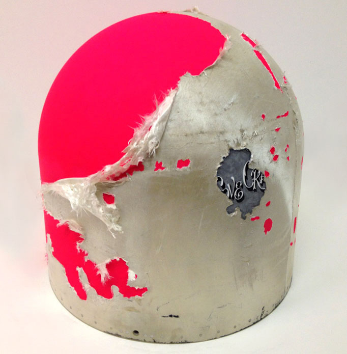
The Boneyard Project is an *amazing* sounding show currently on at the PIMA Air and Space Museum in Tucson, Arizona, featuring World War II airplane wrecks customized by various street artists. (Eric White’s nosecone shown above. See the post for his equally wonderful insight into the creative process.)

Nike has made a commitment to remove water from its apparel dying process. This is a huge deal, while the Nike VP in charge of the program also gave insight into the internal challenge of trying to change the status quo.

Anish Kapoor’s “Cloud Gate” sculpture in Chicago gets a temporary night-time makeover with a new digital installation.

McDonald’s promises to make its pork suppliers provide plans to phase out pig gestation crates by May. Yes, that wording is a little hinky.

By now, everyone has surely read and dissected Jonah Lehrer’s New Yorker piece on brainstorming and ways to promote creative thinking, Groupthink. So I won’t add much but to say it’s a must-read for anyone charged with working on big thorny problems or how to manage collaborative creativity.

Finally, a wonderful story detailing Stanley Kubrick’s obsessive approach to film-making, which the director believed was “an exercise in problem-solving”. This article explains how his focus actually led to the development of Variety magazine’s box-office reports.

Thought You Should See This, February 10th, 2012

Mixed bag last week on Thought You Should See This, the innovation/design-flavored blog I write. It featured everything from cute ads to terrifying robots to the wonderful interactive piece, above, created by Greek multimedia artist, Petros Vrellis as an homage to Vincent van Gogh painting “Starry Night.”

Also last week on Thought You Should See This:

The Digital Trends headline summed up this video perfectly: Swarm of Little Flying Robots Is Amazing (Terrifying).

Teen Vogue editor-in-chief, Amy Astley shared some management advice for dealing with creative types. I used this as an excuse to bemoan the continued lack of accepted metrics for design (as seen in the Catalyst Awards, which I just judged.)

The Superbowl happened, and along with it its ads. I loved the M&M’s ad, while I also loved some of the response to Clint Eastwood’s growly Chevy spot, summed up by one writer as: “The world is a frightening place, so do your duty, buy a car. Someone get me a lozenge.”

New York Times architecture critic, Michael Kimmelman wrote plainly, “It’s time to address the calamity that is Penn Station.” Anyone who has ever experienced Penn Station at any time of the day or night, ever, stood up and cheered.

Big week for crowdfunding site, Kickstarter, which saw two million dollar projects take place. I caught one, for an independent video game, when it was at the $650k mark, and mused about what this means for the “traditional” economy

Former I.D. magazine editor, Ralph Caplan had some pithy things to say about editing and filtering, the difference — and their respective importance.

Amazing Alexander McQueen

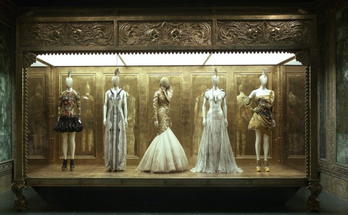
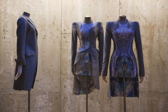
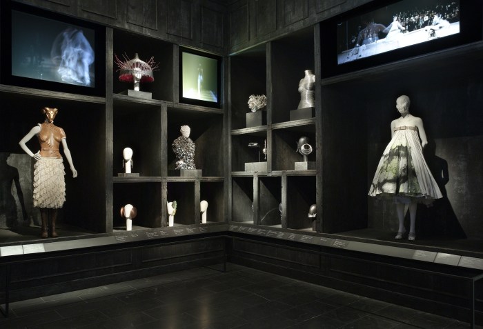
Finally made it to the Alexander McQueen show at the Met. It was a total mob scene; I queued for over an hour to get in, and once inside you get swept along in the slow shuffle of the throng. But, oh my, what a beautiful exhibition it is.

Curated by the Met’s Andrew Bolton, the interior design was by Sam Gainsbury and Joseph Bennett, who have done a marvelous job of capturing the spirit of each collection without turning each room into a different theme park. And kudos to whoever wrote the descriptions and wall captions. Whenever it was possible to get near enough to actually read them, they were strikingly well-written.

Fashion often struggles to take its place in the art world, but this show demonstrates masterfully the exquisite artistry that is possible with needle, thread, leather and, well, myriad other materials. McQueen’s story is so tragic, but looking at his masterfully tailored and created pieces of couture, I couldn’t help but think of him as somehow otherworldly, too. This exhibition will make you think about fashion in entirely new terms.

All images courtesy of the Metropolitan Museum of Art.

The real theater on display at Christian Marclay’s exhibition

If you didn’t hear about it, the artist Christian Marclay’s The Clock was on show in New York recently. Essentially, it’s a 24 hour abstract film: Marclay expertly spliced together thousands of excerpts from movies old and new, familiar and foreign. Each shot is somehow related to time–and the whole thing plays in real time. So if you popped in at 4.30 pm, you’d more than likely watch clips about afternoon tea. Visit one of the late night showings and see rather racier clips. (That’s pure hearsay: I turned up at 10 o’clock one Friday night and the line stretched a two hour wait around the block and I wimped out and went home.)

The show has received raves pretty much everywhere it’s played. See reviews here, here and from the London show, here. And for what it’s worth, I agree with the experts. The film is totally mesmerizing. I watched, spellbound, for three hours, and only reluctantly dragged myself back to life’s more regular programming.

What was even more mesmerizing, however, was the behavior of the assembled masses. As I waited to get in, one of the security guards regaled me with some excellent stories of the tantrums people had tried to pull in order to jump the line. (Just an aside, but if you ever hear yourself uttering the immortal phrase, “Don’t you know who I am?” it’s time to have a serious word with yourself.) This guy wasn’t fazed in the slightest. “I don’t care if you know Miz Cooper, Mr Marclay or the Pope,” he said vehemently. “I’m not ruining your life. I’m doing my job.” And do it, he did.

There was some even more amazing theater on display once you actually got inside. You can see the layout of the space below. What’s not so clear is that there weren’t enough seats to go round. At least half the crowd had to stand or sit alongside the edges of the gallery. Initially, for instance, I got a spot sitting halfway along the right hand wall—and I quickly realized that the subplot of the film was going on in the room itself.

Whenever someone got up from a sofa, it sparked a quiet, fierce, intense and entirely mean-spirited free-for-all. I saw two women lose all sense of decorum as they pelted towards one spot, one of them throwing her bag onto the seat, the other throwing up her hands in silent disgust. I even got caught up in it myself. I moved to take a seat that opened up right next to where I was—but moved way too slowly. Suddenly, some guy came out of nowhere, skidded past me and plonked himself down. I stammered unintelligibly—I’m excellent in a crisis—and then he played a devilish joker card. “Do you mind?” he said as he settled in. “I don’t feel at all well.” (Later on, of course, I came up with all sorts of witty comebacks as to why he should clearly go home and I should get to sit down. At the time, I meekly slunk back to the wall again, throwing up my own hands in silent disgust.)

I’m not sure it’s quite what Marclay had in mind when he put together his masterpiece, but the additional elements of musical chairs and Benny Hill actually enhanced the experience. Not to mention provided a useful reminder: never hesitate.
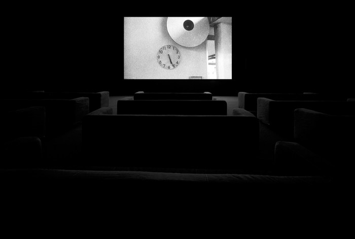
Images © Christian Marclay. Courtesy Paula Cooper Gallery, New York.

Ryan McGinness: Black Holes

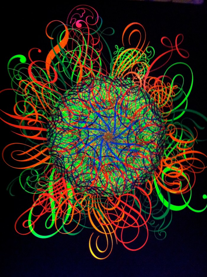
Last night, I went to celebrate artist Ryan McGinness’ latest installation, at Philips de Pury in Manhattan. Black Holes is an exhibition of work McGinness created from 2004-2010. The large round canvases are deceptive. On first glance they look like fairly simple spirograph-style images. But stand in front of them for any length of time, and get drawn in inexorably by the delicate, hypnotic shapes. Black holes, indeed.

<

For this exhibition, McGinness added a neon flourish, adding delicate wisps of vinyl around some of the canvases and lighting them with fluorescent light. One long stretch of these can be seen from the High Line walkway, sure to confuse and delight late-night tourists. Somehow the effect transcends the usual gaudiness of neon and is bewitching, poignant, and glorious. As are the newest, black-on-black canvases, which are subtle but somehow defiantly perfect. Gorgeous.

Naoshima: The Island of Inspiration

This piece was originally written for Creative Review magazine. I’ve posted the beginning of it here, along with some of my own photographs of the island. (Ferry ticket machine pictured above. I took the first morning boat over to Naoshima. I was, it’s safe to say, super-over-excited.)

I’m standing in a hut in pitch darkness and a man is trying to tell me what to do. In Japanese. This is something of a problem, as I don’t speak the language, and he clearly doesn’t speak English. As he gently presses on my shoulders, I attempt to take a seat and promptly sit on someone’s lap. Whispered apologies and slightly hysterical, hushed giggles ensue before I find a space on the bench and then quiet falls. As we continue to sit there in the darkness, a faint glow begins to shine gently. It’s like the dawn of sight, and it’s all part of the masterplan. In James Turrell’s Minamidera, the perception of light is a matter of careful design. And in an age when ‘experience’ has become the focal point of so many advertising, branding and marketing campaigns, here the experience is all there is.

A modern art mecca
Light plays an important role in many of the galleries and installations on Naoshima, a small island off the south coast of Japan that in recent years has become something of a modern art mecca. Three galleries feature works by artists such as Bruce Nauman, Walter de Maria and Lee Ufan. The buildings were designed by Tadao Ando, the self-taught Japanese architect who predominantly uses cast-in-place concrete, with steel, wood and glass, in his structures. On Naoshima, light is his fifth element.

Read the rest of this piece here.

Yayoi Kusama's iconic Pumpkin sculpture
This is the roof of the public bathroom designed by Tadao Ando, in Honmura
The view from deep within Hiroshi Sugimoto’s Go’o Shrine
The sleepy fishing village of Honmura
Shinro Ohtake’s piece for the Art House Project in Honmura includes a replica Statue of Liberty punching her way through one of the floors of the building
A real life lily pond, mimicking those found in the Monet paintings on show at the Chichu Art Museum
The view from my hotel room
Gazing down into the outdoor gallery featuring photography by Hiroshi Sugimoto